
SWAT Routes
Helping route planners split orders so they can optimise vehicle space.

UX
UI
Research
Usability Testing
Wireframing
Prototyping
Role
Product Design Intern (Led the end-to-end design process with guidance from seniors)
Tools
Figma
Notion
Timeline
1 month
Background
In Lotus’s, one of the most critical KPIs for route planners is trip utilisation(%), which measures how efficiently vehicle capacity is used for deliveries. The goal is to maximise the load per vehicle while minimising the number of vehicles required. To achieve optimal utilisation, manual intervention is sometimes necessary to fit more orders into existing vehicles.

Problem
Without the ability to split an order into smaller parts, planners are forced to over-assign vehicles, underutilise available capacity, or leave orders unassigned. This inefficiency not only affects day-to-day planning but also impacts the overall cost-effectiveness and scalability of operations.

Understanding the user

Logistics Route Planner
37 years old
Bangkok, Thailand
Bachelor’s degree in Logistics & Supply Chain Management

I studied their existing workflow, from the moment they've imported orders to the part where their route planning has hit the utilisation KPI (≥95%). I identified the entry and exit points where planners would want to split orders.

References
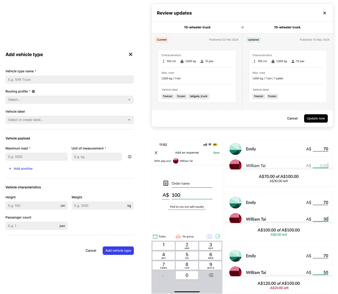
Key design considerations
Key explorations
Modal, drawer, toast, banner
Scrim
Toggle switch
Slider
Horizontal vs vertical layout
Input fields
Loading states
Error flows & states
Integrating AI into the process, I weighed the pros and cons of each idea, analysed the scenarios they were most suitable for, and made design decisions with trade-offs considered.

High-fidelity wireframing & prototyping


Final design
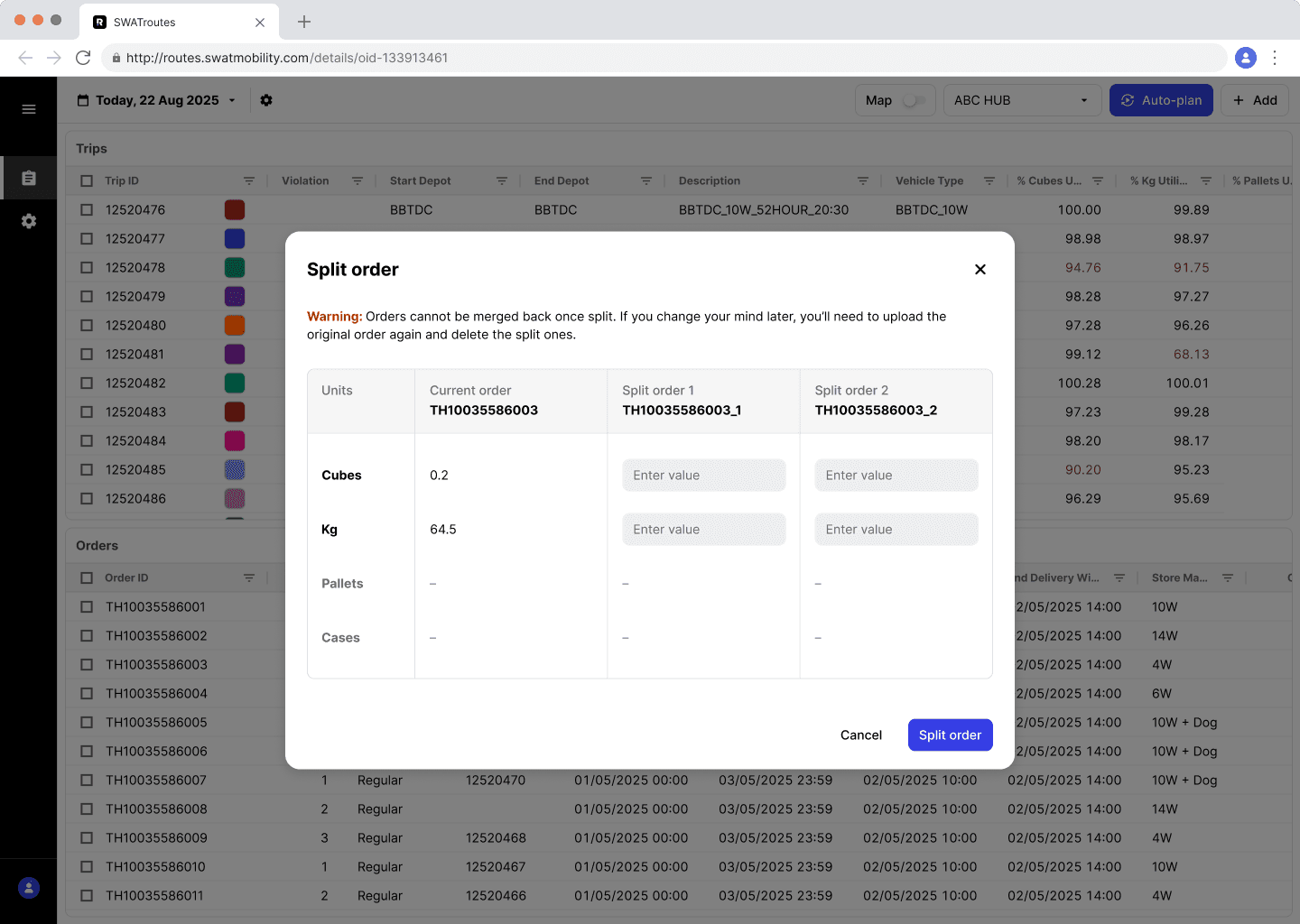
Keeping in mind route planners' goals, challenges and behaviour, I made sure the final design was:
Accessible
Clear
Quick
Scalable

↓
↓

↓

Interact with the prototype below ↓
Usability testing
Objectives
Assess whether users are able to split an order successfully and confidently.
Identify usability issues related to calculation logic.
Check if users understand error messages when they occur.
Check whether users are able to find the orders they have split.
Key Metrics

Key findings
✔
Participants were generally able to complete their task easily.
✔
Participants understood auto-calculation logic.
✔
Participants understood error messages and knew how to resolve them.
𝙓
Many participants didn't know where to find their split orders.
We couldn't resolve this issue completely, but came up with other ways to make it easier for the user:
Sort orders by alphabetical order by default, so the new child order appears next to the parent order
Snackbar appears to notify them about the split order names—users can copy an order's name and search for it
Split orders flash in green briefly immediately after split confirmation, to capture the user's attention
I'm incredibly proud of how this project turned out, especially since I'm designing a whole new feature for an app. It was reassuring to know that my eye for visual hierarchy helped make this feature clear and easy to use.
Back when I was a Graphic Designer and Art Director, I was used to designing based on instinct and personal preference. Designing for this product with the UX process has taught me that good design can be rationalised.
Documenting every decision and every part of the process helps to answer any questions that may come up from team mates and stakeholders. This builds their trust and confidence in me as a Product Designer.
I also learnt that a new feature or component may affect the entire design system. We must always consider how they will fit in the design system and whether other components have to be re-evaluated to maintain consistency across products.