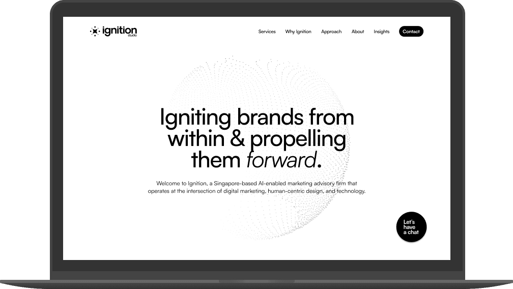
UI
Research
Web design
Branding
Site traffic benchmarking
Using data from Google Analytics, I'll monitor the performance of Ignition's website and compare it with how it performs after the redesign.

Competitor benchmarking
I compared Ignition's website with three competitors' to learn about what they're doing well, key conventions, and what to avoid.
Ignition.


Strengths to emulate
Engaging visual on landing page, fit within the fold
Clear sections and visual hierarchy
Consistent branding
Concise information
Key conventions
Information architecture of site that matches users' mental models
Navigation bar at the top, footer at the bottom with key information
Features to avoid
Navigation bar and footer taking up too much unnecessary screen space
Too much text and fluff copy

Online survey
I created an online survey using Google Forms and sent it via WhatsApp to 10 participants who use the internet daily.
Key findings
The primary goal of most users was to learn about the services offered.
The branding, website design and UI can be improved so that users' impression of Ignition's capabilities and credibility can be enhanced.
Users want to see case studies, and more details about the services offered.
Contact details can be made more obvious.
Exploring a new look
Keeping in mind Ignition's core values and personality, I designed a new logo and established the brand fonts.


UI design
Apart from applying Ignition's new branding, I improved the visual hierarchy, added animations, challenged the information on the site, removed unnecessary details, and made sure each section was more distinct.
Old design

New design


Active users
↑ 5.9%
Engagement rate
↑ 50%
Engagement time


